

There are thousands of sites out there offering tips and tricks for using CSS. But how do you know where that information is coming from? Who says the people writing these “tips” know what they’re talking about? For all you know, it could be someone who has not clue what CSS even stands for, let alone how to use it effectively.
But that’s not the case with the experts below. They’re all well-known for their mastery of CSS and all that goes along with it. Read on for their tips and tricks with regards to everything from avoiding hacks to understanding the box model.
Peter-Paul Koch: Avoid CSS Hacks
As web design has progressed, the endlessly nested table has transformed into the endlessly complicated CSS hack. In many cases, CSS hacks solve one bug by exploiting another one; not exactly the most stable way to fix something. When the next version of the browser is released, it might fix neither or both bugs, or it might fix one but not the other. In any case, it’s likely your hack might end up not working, or not being necessary any longer.
Jonathan Snook: Avoid Unnecessary Selectors
To keep your style sheets as short and condensed as possible, avoid repeating yourself by only specifying the minimum number of selectors. In other words, do you really need to specify UL and LI? Why not just specify the UL? The same goes for other elements likely to be nested. Just specify the upper-most level and leave the rest to inherit those styles.
Roger Johansson: Specify a Maximum Width for Em-Based Layouts
Creating an elastic layout that don’t specify a maximum width in anything other than em units is a quick way to make a very uncomfortable site. As your visitors increase the text size, your layout gets wider. But what happens when they increase the size by more than one or two em units? Your layout just gets wider and wider and pretty soon they have to scroll horizontally in order to read an entire line. Specify a maximum width to avoid that problem and make your site more user-friendly.
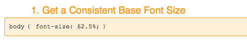
Trevor Davis: Set a Consistent Base Font Size
By setting your base font size at 62.5%, you end up with a font size of 10 pixels. This makes 1 em equal to 10 pixels. 1.2 em is then equal to 12 pixels. It simplifies font sizing in all of your selectors thereafter.
 />
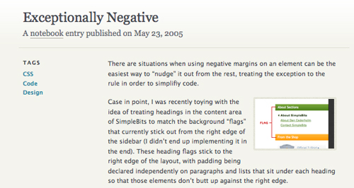
/>Dan Cederholm: Use Negative Margins
Using negative margins can greatly simplify your code. Instead of specifying positive margins for a dozen or more elements, why not just specify a negative margin for one? It makes your style sheets shorter and less complex.
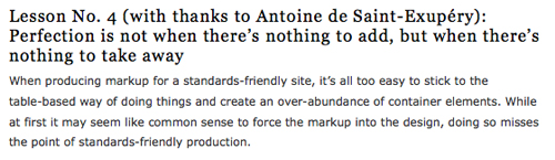
Ben Henick: Don’t Add Markup Unless Context Encourages It
When transitioning from table-based layouts, many designers are tempted to add in an abundance of container elements. But CSS isn’t the same as tables. Thinking through your design ahead of time is one way to avoid this, as is focusing on the information first. Try to only use divs and spans for content elements that share a common purpose or classification and are repeated across multiple pages.
Eric Meyer: Use Print-Specific Style Sheets
Forget about creating separate printer-friendly pages for your content. Use CSS to create media-specific styles for your documents instead. Printer-friendly style sheets are easy to create and avoid problems designers used to encounter regarding the regular version and printer-friendly version being slightly different from each other. After all, with this method you’re not touching the page markup at all.

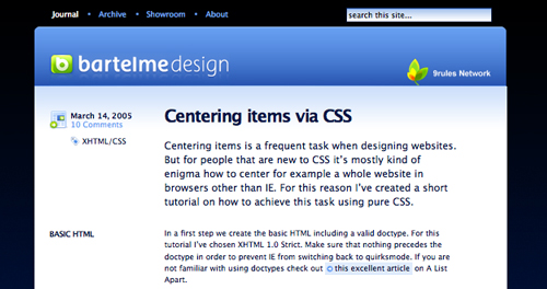
Wolfgang Bartelme: Center with CSS
For people just starting out with CSS, centering an entire website can sometimes seem like an impossibility. But it’s definitely possible and actually relatively easy to achieve.
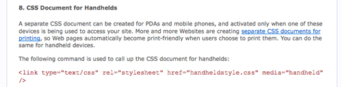
Trenton Moss: Use Mobile-Specific Stylesheets
With more and more people browsing the web primarily through mobile devices, it’s important to make sure your website is optimized for those visitors. While most handhelds will render pages reasonably well using standard CSS, it’s still not the best user experience on a 3″ screen. Create a separate mobile style sheet to optimize the experience for mobile users.
Chris Coyier: Use the CSS Overflow Property Correctly
There are four different values available for the CSS overflow property: hidden, visible, scroll, and auto. By understanding what each of these does and how each behaves, you open up a lot more options for your site’s layout.

Ethan Marcotte: Create Fluid Grids with CSS
The idea of creating a fluid grid design, especially with CSS, is likely to send shivers down the spines of many web designers. But it is possible, and is definitely preferable to creating them with tables.
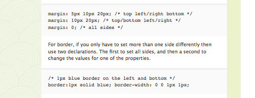
Jonathan Snook: Use CSS Shorthand
Using shorthand is another way to simplify and shorten your stylesheets. Instead of declaring separate styles for each margin (margin-left, margin-right, margin-top, margin-bottom), just declare them for all four at one time. The same goes for other elements, such as font, border, or background.
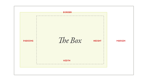
Chris Coyier: Understand the CSS Box
Everything element in CSS is a rectangular box. Padding, margins, height, width and borders all interact with these rectangular boxes. Gaining a real understanding of how these things interact will make life as a designer infinitely easier.
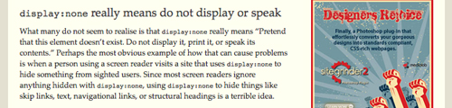
Roger Johansson: Be Wary of Hiding Things With CSS
It’s tempting when you want to hide an element on your page to use “display:none.” The problem with this, though, is that this particular declaration means that the contents within that element are completely hidden—they aren’t printed, displayed, or spoken. This can cause issues for those using screen readers as opposed to viewing your website. It can also cause issues when you’re going to hide something until a user performs a certain action (most likely with JavaScript).
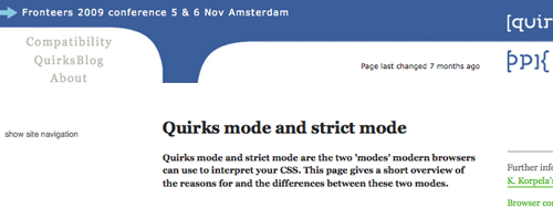
Peter-Paul Koch: Know When to Use Strict Mode or Quirks Mode
Strict mode and quirks mode apply to the two different ways modern browsers use to interpret CSS. By understanding what each one does and then implementing the correct one for your design, you can greatly improve your site’s functionality.
 Posts
Posts


0 comments